My Design Process
A few weeks ago I asked my Instagram followers if they wanted to know some of my decorating tips and tricks, where do I start a room design and how to get to the final product. Overwhelmingly the answer was yes, and I intended to do a few tips and tricks in Instagram “stories”. I tried a few times to get into it on Instagram, but it always ended up being pretty long and rambling, and I thought a better place for it might be in a blog post where my thoughts could be better organized. So here goes! I hope you have a hot drink and a comfortable chair, because this is a long one! Or you can pin this post for later!
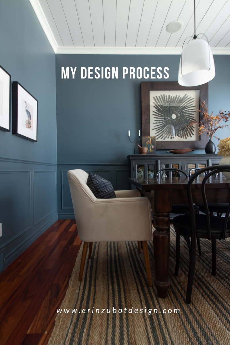
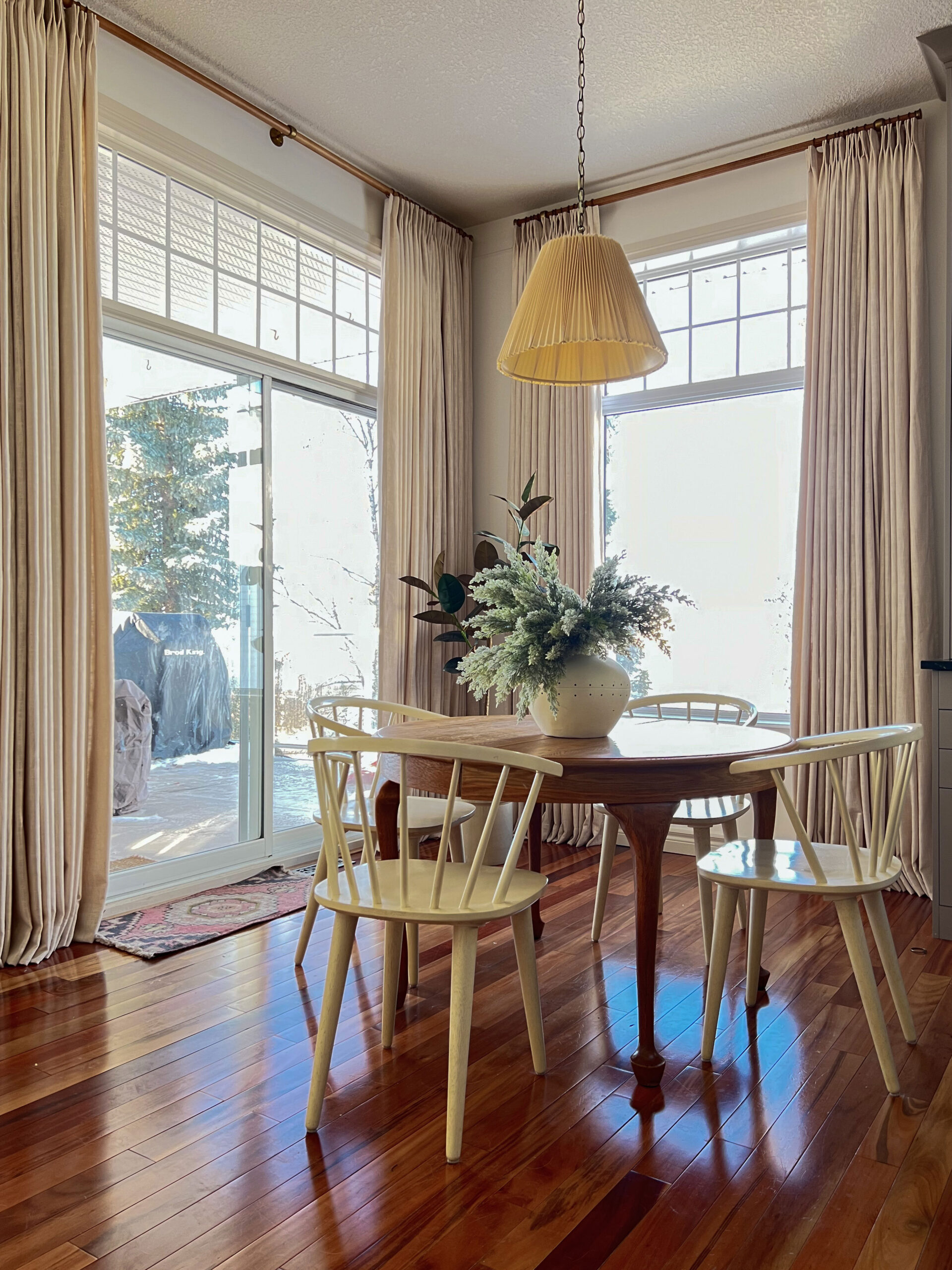
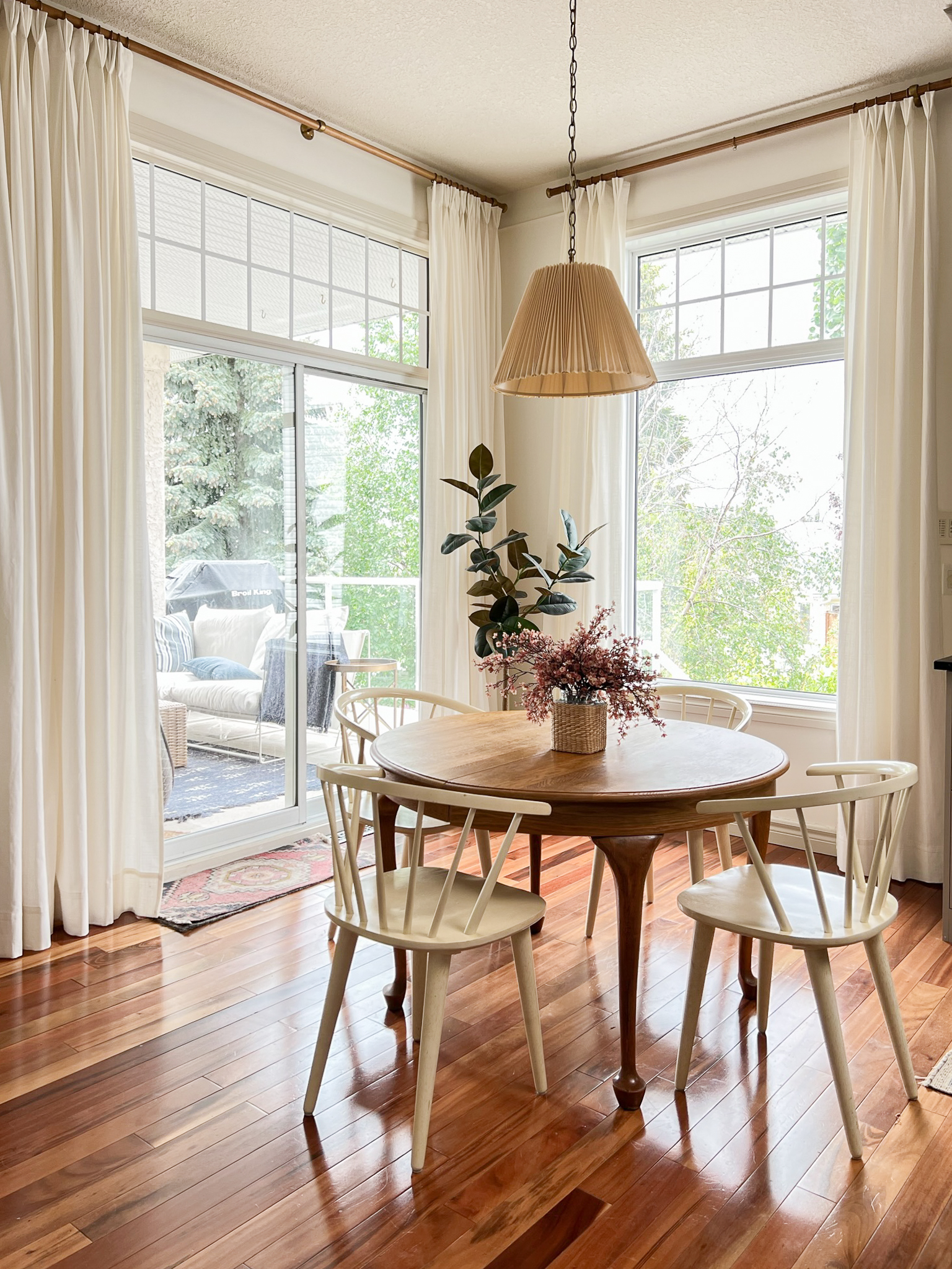
I’m going to use my most recent project, my dining room, as an example and lead you through the process, step by step.
This post may contain affiliate links. That means if you purchase anything from these links I earn a small commission, at no extra cost to you! This helps support my blog, so thank you!
Step 1 – Pin Pin Pin!
I ALWAYS start my process on Pinterest. I search for rooms that I love and pin them. In this case, dining rooms. I might also have some saved posts on Instagram or some inspiration from magazines, but I always collect all of those things on a general pinboard. Once I have a BUNCH saved I go and look at them and see what they might all have in common. Style, colour, pattern, what do I like about them? Is there a common thread? Is there one particular pin that really speaks to me? In my case, I noticed that I loved the moody dining spaces the most, ones that incorporated at least a little bit of colour but also a lot of neutrals. I also noticed that I loved a little contrast and I know about myself that I like traditional details with some modern elements. Ideas will start to form at that point, but they are vague. This is the my pin board for this dining room which includes both smaller ideas for furniture or lighting or just beautiful dining rooms in general.
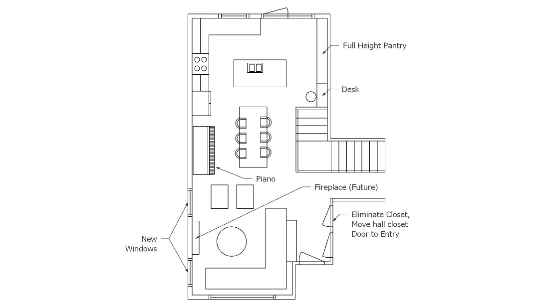
Step 2 – Floor Plan
This step may or may not be required depending on the room, but if you are planning new anything (rugs, furniture, rearranging your existing stuff) I think this is an important step. I do the floorplan up in Sketchup but there are lots of online, free programs that do this. Roomstyler I have used, as well as the Ikea planner, if you can believe it! I have also just drawn my room to scale on a piece of grid paper (usually one square = 1 foot) and then cut out all of my furniture pieces to scale and moved them around the room. Getting a good floor plan is key before you start investing in pieces that may or may not fit in your space. If I have existing furniture I put that in first, and then any pieces/ rugs I might be considering. I don’t need the specific pieces chosen at this point but the scale is important so I don’t look at furniture that is not going to work in my space. You can google things like how much space you need behind a dining chair, how big should a rug be, what is a good width for a walkway, etc. to make sure the scale of your furniture is appropriate. In the case of my dining room, I already had the furniture in the room and I knew they would work well so I skipped this step.
Step 3 – Start a Mood Board
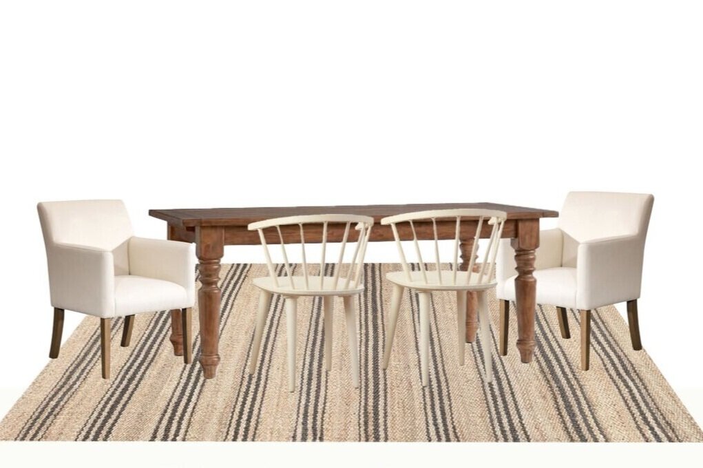
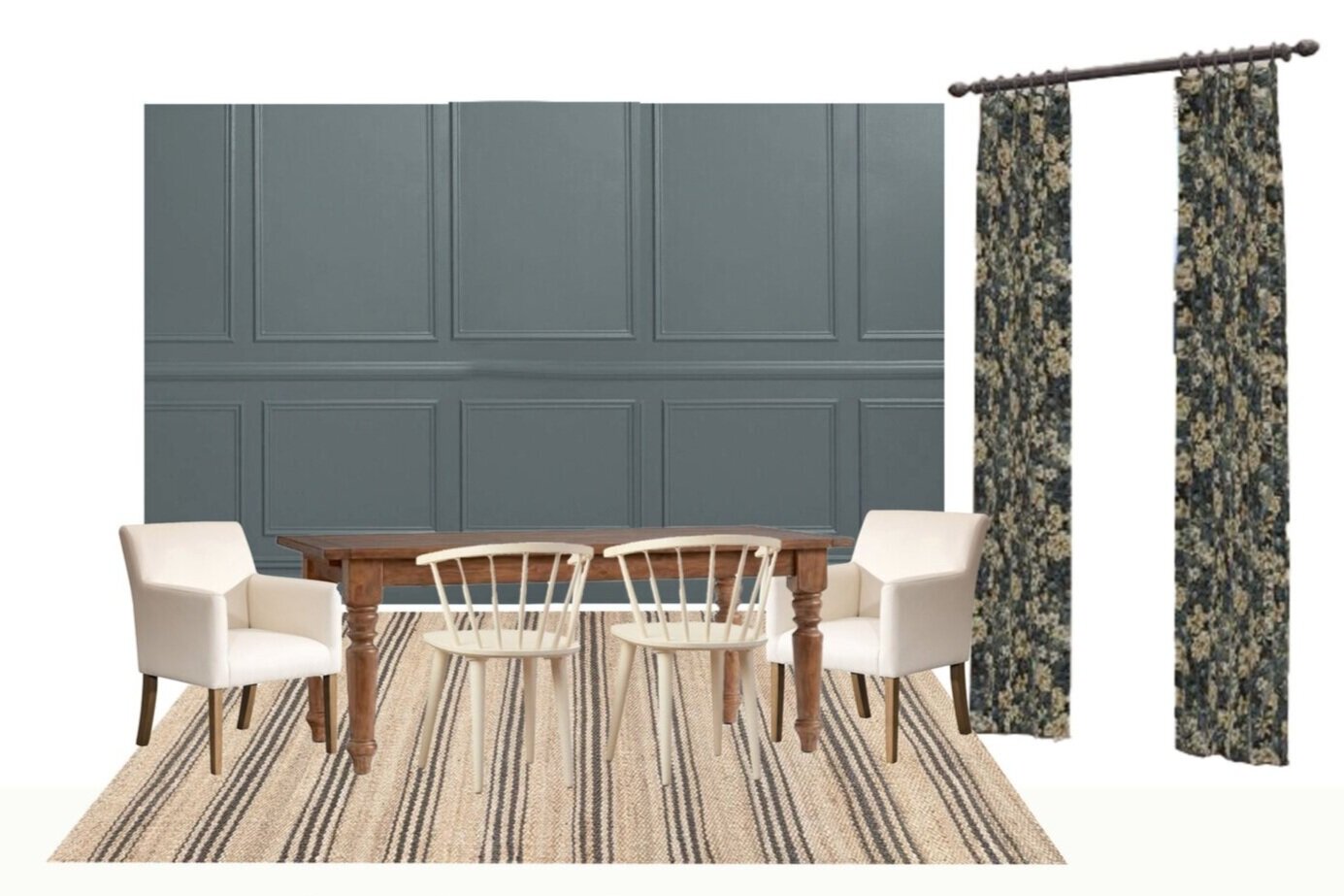
I sometimes design without a mood board for quick decorating updates, but more and more I’m trying to include them. It seems that if I do one, my project turns out better. Even for small projects, I’ve been trying to do it. Visualizing items together is so important for a cohesive room!
In my case, I almost always have pieces of furniture I can not/ don’t want to replace, so I bring those in first to make sure they work with the other elements I bring in. Wouldn’t it be nice to be able to buy all new stuff? But that is not practical for most people, myself included. So once that’s done, I need a jumping-off point for colour. If my room is not going to be all neutral (and many of my spaces are not) I need to nail down a colour palette. And this leads to the next step.
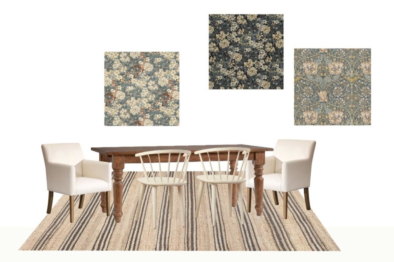
Step 4 – Find the Inspiration Piece
This I learned from Sarah Richardson and I almost always start a colour palette this way. I find a jumping off point to base my colour palette on. This is often art, a rug, or a textile. In my case I had a fairly neutral rug already and I wanted to include some more pattern somewhere, so thought perhaps it could be curtains. I really love to mix patterns and the idea of some fun patterned curtains excited me!
Side Bar: Pattern mixing is not as hard as you think. Follow a few basic rules and you will be mixing patterns like a pro! 1) Keep the colours in your patterns consistent. 2) Mix the scale of the pattern – large scale (my rug) medium scale (my pillows) small scale (curtains). 3) Mix geometric/ florals or curves/ stripes. If one pattern is a floral (curtains) mix it with some stripes (rug) and a geometric (pillows), each with a different scale.
In my case I used the curtain fabric for my inspiration piece to inspire the colour palette, but it may be a favorite rug, or existing art, or really anything at all can inspire the palette. Whatever your piece is, find that first and build the room around it. I found this lovely fabric from Calico and fell in love with it instantly and knew I wanted the room to revolve around it. I knew it would work well with my existing furniture because I popped it into my moodboard and it looked fabulous. (I tried quite a few different fabrics in my mood board to see what I liked best!)
Step 4 – Build The Room
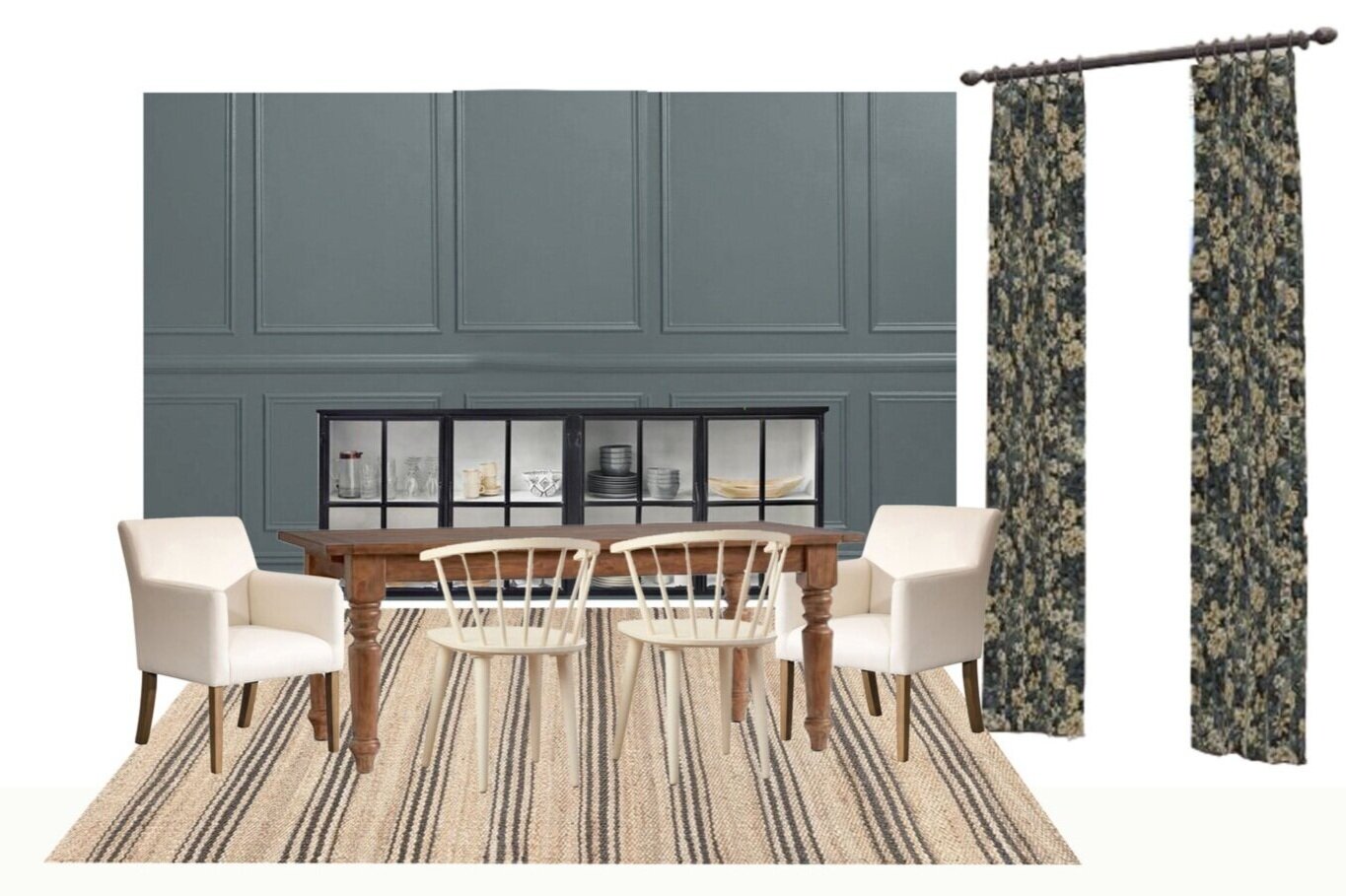
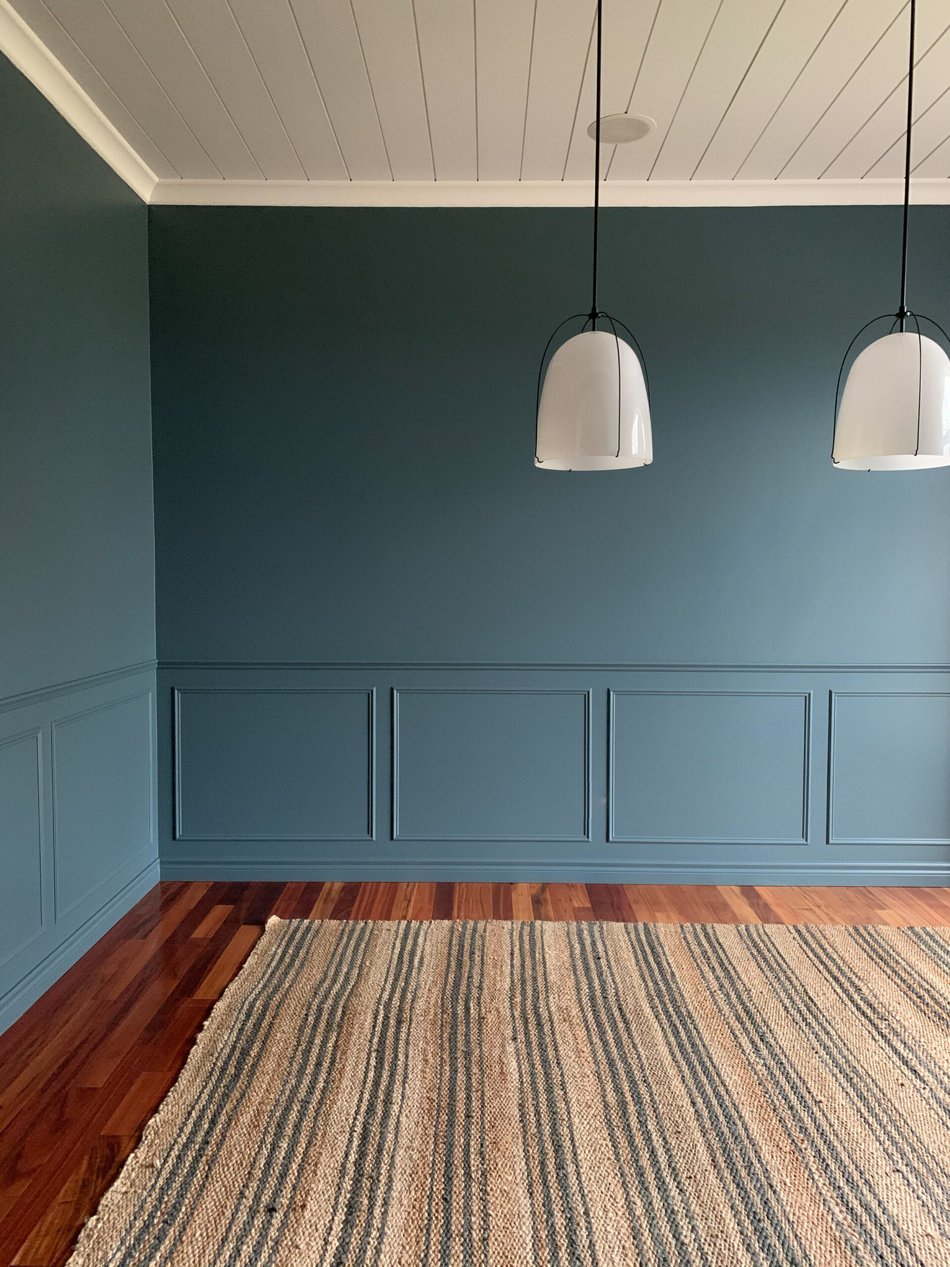
Once that’s done, I go back to my pin board and look at those favorite pins – what did they have in common? What do I know I want to include for sure? In the case of my dining room, I knew I wanted some kind of moulding (I always love to add in some architectural interest) and some colour. Because my dining room was separate from the rest of the living spaces, going for an all over colour worked in here, so I brought that in next! Working off of my inspiration fabric, I thought a grey-blue would be beautiful with that.
Side Note: I never choose the colour at this stage, just the general colour direction. Once I have all the elements together and in hand (in person!), I choose a few swatches and always test them, in real life, in the space. You can NOT choose a colour on a screen.
Ahhh it’s looking good but wait – that hutch I was thinking of using (not shown) is not going to work with the blue walls, because its also blue. Sometimes your existing pieces don’t work with the direction you are taking the room. There are two things you can do at this point – take a step back and rethink something (in my case, I could have gone with neutral walls so my existing hutch would work) or replace or redo/ replace that piece that isn’t fitting. I heard someone say once that you should not build a room around a piece you do not like, your design will never be very good and I often try to remember that when I’m struggling to make something work. Sometimes it just DOESN’T and that’s when we go have the hard conversations with our husbands about maybe selling that thing and getting something new. This doesn’t always mean something totally NEW, I’ve sold pieces before and replaced them with something I bought second hand that fit the space better for little to no extra cost. In my case, my hutch fit very well size wise into the room and just needed to be a different colour. So, I decided to paint it! Easy fix.
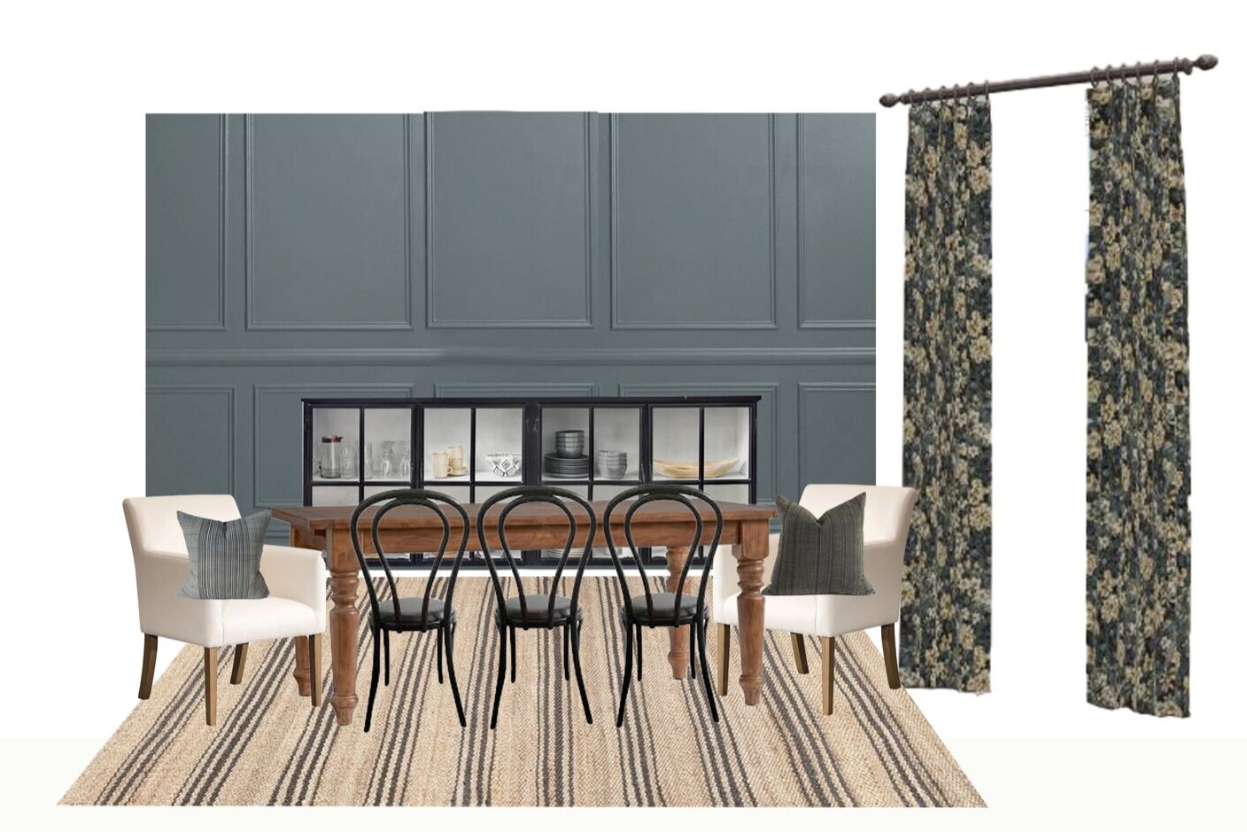
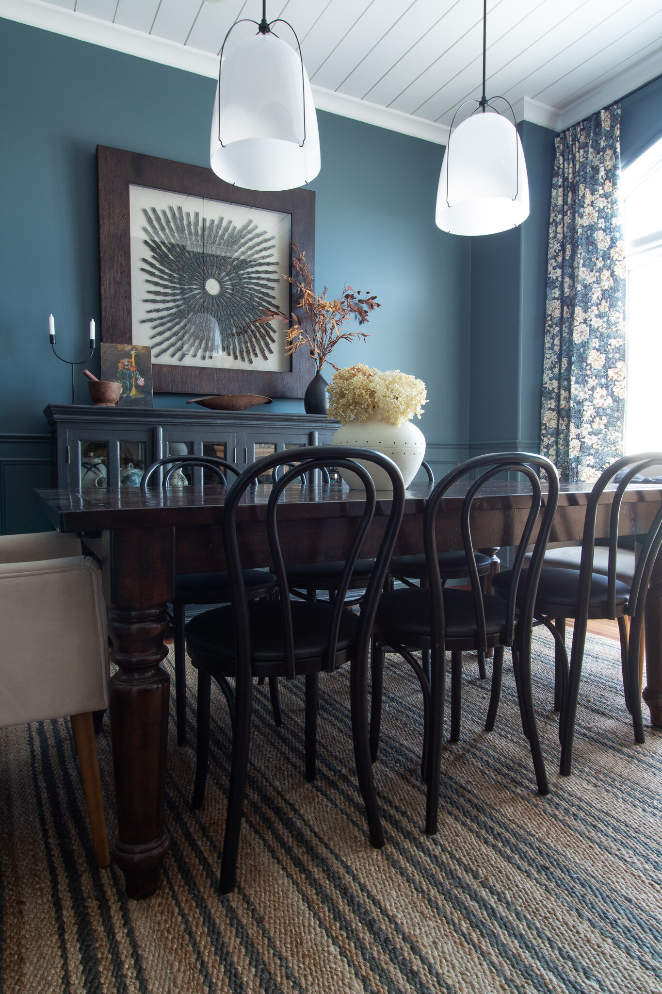
The inspiration fabric was really quite moody and so were many of my inspiration rooms, so I tried to keep that in mind as I was building the space. I happened upon some bentwood chairs on Facebook Marketplace, so I decided to move the white chairs to my kitchen and use the secondhand bentwoods in this space, and paint them black.
Step 5 – Make the “Outliers” Work and Tie It All In
I knew that if we removed the old fixture (which consisted of a large drywall box, it was weird!) we were left with a giant hole in the ceiling that would need to be patched. Rather than trying to repair the textured ceiling, I decided it would be easier and probably look better to plank the ceiling. That went along with my decision to add architectural interest, too. I considered painting the ceiling the same colours as the walls to really envelope the space in that MOOD (which would have been gorgeous) but at the end of the day I know myself and I know that there was a good chance that this room will be repainted at some point in the future and I did not want to have to paint the ceiling again. I also knew that just outside of this room the walls would be white, and so having something in the room to tie it to the rest of the house was important, so I decided to paint the ceiling one, one time, and never have to change it.
Having a bright white in here when everything else was black, tan, cream and blue was a problem. So in order to make that work, I brought in some more white. It didn’t need to be a lot – in my case the only other white things were the pendants and the mats on some of the art – it just needs to be enough to make it look intentional. And that brings me to my next step – repetition!
Step 6 – REPEAT REPEAT REPEAT
Making something work in a space has a lot to do about repetition. Having a few things in the same colour/ texture/ finish makes the design look intentional. This goes for styling as well as furniture. If you have one brass thing, make sure there are a couple of other brass things to pick up on it. In the case of my sideboard, the knobs were brass and so was the tray, and the tops of the decanter were chrome. I fixed that up with a little brass spray paint because those chrome tops stuck out like a sore thumb – there was nothing else chrome in the room.
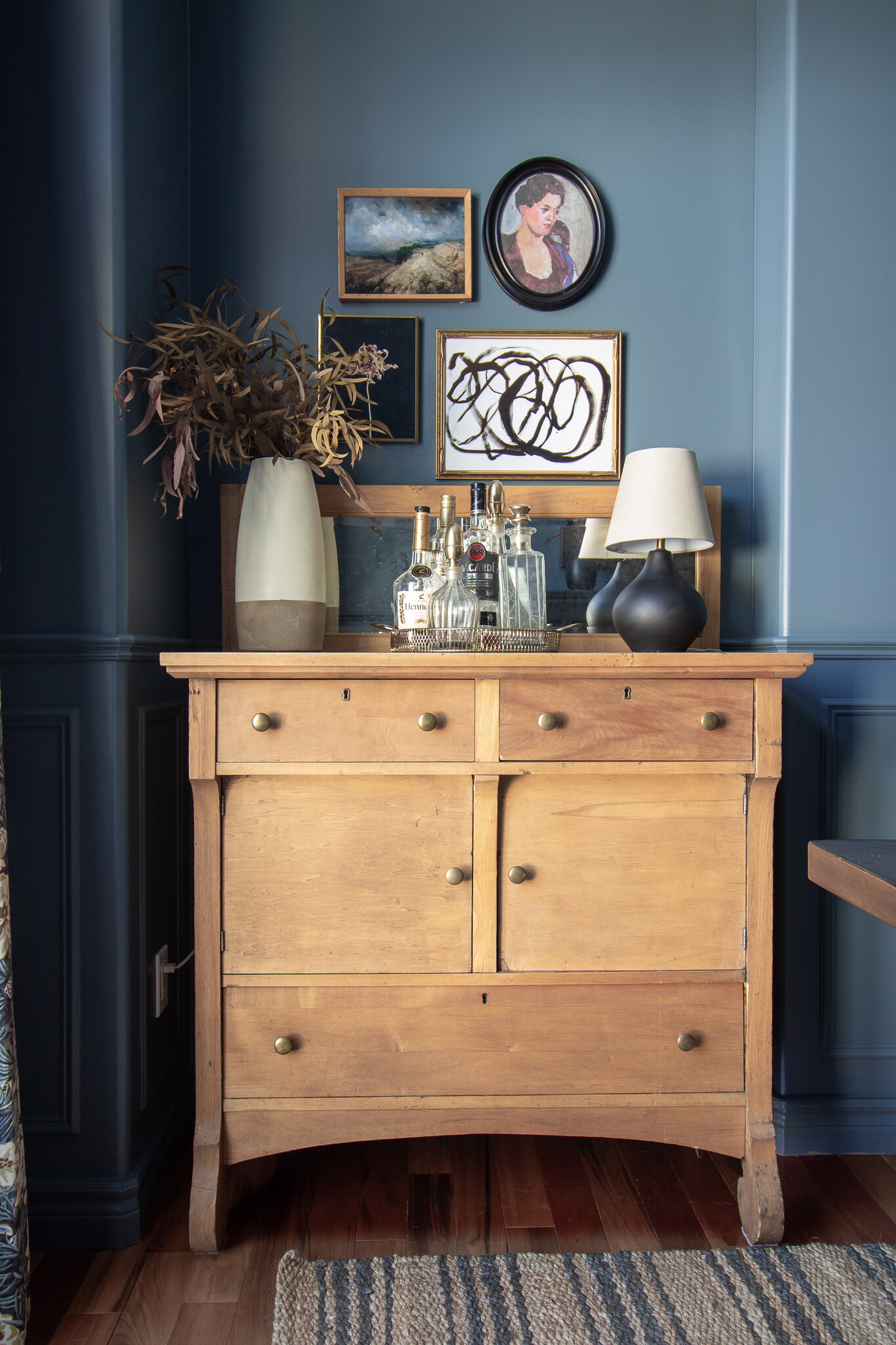
My table was dark wood and there was nothing else to tie that in, so I brought in this large scale art piece that had a dark wood frame. If I had not had that art piece on hand, I would have purchased or made a dark wood frame to tie that in, or found some other way to make my dark wood table look intentional. Notice the legs of the white chairs are a lighter tone wood, like the antique sideboard in the photo above?
Other Tips
Mix Warm and Cool Tones – One other trick I like to consider is always trying to bring in both warm and cool tones. Before this room had only warm tones (reds, oranges, yellows, beiges) with the brown and orange walls and brown and orange floor. I needed to cool that down with some cool tones (blue, green, white, grey etc). Once the walls were blue, it was safe to bring in those warm pieces again, like the wood table and rug.
Mixing Wood Tones and Metals – You can mix different wood tones as long as they are not too similar and have a similar undertone. In my case I had a dark wood table and it mixed well with the raw light wood of the hutch. The legs of my end chairs are also that same light wood tone and the hutch colour is also repeated in the inspiration fabric of the curtains. The same goes for mixing metals – I had a little brass on the hutch knobs which are repeated in the tray, the decanter tops and the frames. I also have some black metal in the knobs on the sideboard and the light fixture.
Look at a Colour Wheel! – This is one thing I did learn in design school that I didn’t know much about before, and that’s to consider the colour wheel. Every wonder why orange and blue look so good together? That is because orange and blue are complementary colours (or opposite to each other) on the colour wheel. When choosing a colour scheme, you should have a little peek at a colour wheel once in a while. There is a whole colour theory that I won’t go into right now but in general, if you like contrast like I do, if you pop something into the room in a complimentary colour its always going to look fabulous. For example, with my blue walls, the antique dresser has an orange tone to it so it POPS against that blue. Something as simple as a vase of orange flowers would have been awesome too. There are other ways to work with the colour wheel (like an analogous colour scheme, which uses colours that are next to each other on the colour wheel) so it might be worthwhile to do a little colour research before you start your colour scheming!
Consider Contrast – There are different ways to design a room and you should decide which one you want to be – high or low contrast. High contrast would be dark elements in a white room, complementary colours, etc. Low contrast would be a more similar palette (all white, all soft pastels, analogous colour schemes). I tend to prefer rooms with some contrast because I find them more interesting and striking, but for a calm serene space, you might want to consider low contrast for more of a calm mood.
Consider Style – Think about the elements in the space and what style they are – are you boho-modern? Then you probably don’t want to bring in a very traditional toile pattern. I feel like most people do this pretty well naturally, they tend to like what they like and it usually falls within their own style category. I also say this loosely because mixing styles is one of my favourite things, but I do find it hard to pull off. My particular style I would say is traditional with a few modern elements to keep things fresh but I have to intentionally add these in because otherwise, I tend to make all very traditional choices.
So that’s about it! Whew that was a lot of information I know. I hope you all find this helpful and it can make your designs more cohesive in your own homes!
beautiful room, the moulding in a moody color is beautiful. i love that you went through your process. i have a similar process, but i’ve been fairly lazy recently and haven’t been the best at planning ahead! i have to get back to it. thanks for the inspiration!
Thank you Amber! I’m glad it’s inspired you, that’s fabulous!